I believe one of the many things that bring glory to God is beauty. Of course beauty is from His hand; it is His idea. It is part of who He is. Beauty surrounds us… from the very small design of a snow flake to the awesome and vast landscapes and the wildlife that inhabit those landscapes, to the billions of spiral galaxies and the incomprehensible expanse of the universe. God is a God of beauty.
Therefore, I view painting as an attempt to point to the beauty God has created. Art that brings Him glory can be viewed as a simple reminder of His glory.
The heavens are telling of the glory of God; And their expanse is declaring the work of His hands. Psalm 19:1
This brings me to the subject of this post… a limited palette. I started out thinking I needed 20 tube colors to do the task at hand. The more the merrier was my motto for several years. But, I have stepped off that thought process and cut those colors down to three various combinations of primary colors. (usually).
Limiting the palette does not limit the results that are possible. When I started experimenting with a limited palette several years ago, I originally thought the results would be as it’s name implies, very limited. However, the opposite seems to be true. Limiting the palette actually solves some of the problems inherent to painting. Right out of the shoot, a limited palette brings color harmony to a painting. It also fine tunes the color mixing process. Not to mention it simplifies the whole painting process.
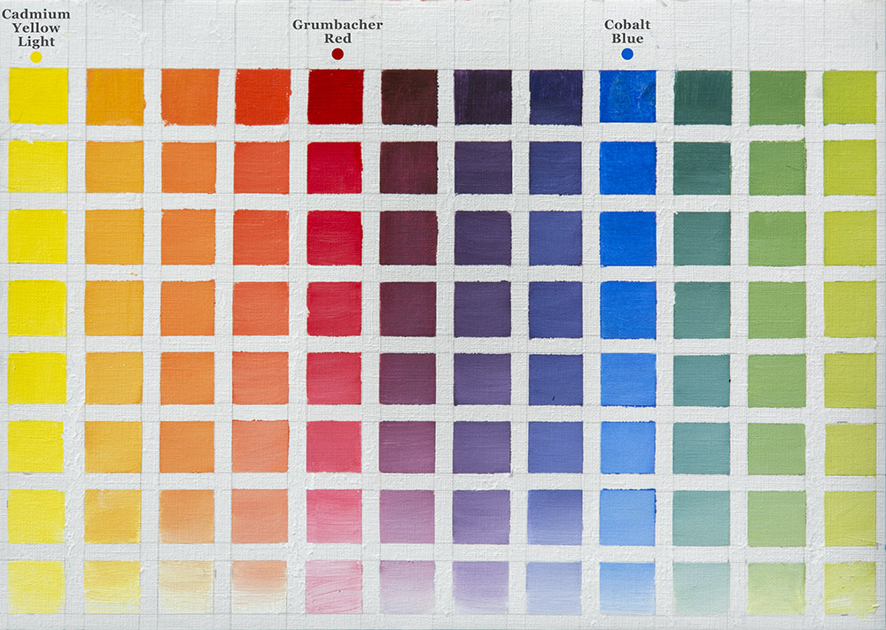
After experimenting with several limited palettes the past few years, I recently I tried a limited palette of Cobalt Blue, Cadmium Yellow Light (which I have used in other limited palette combinations) and Grumbacher Red. If you wonder why Grumbacher Red, let me tell you I choose this particular red because of a deep philosophical journey…. It was all I had at the time and was too broke to buy any other 😊 The tube I found is very old, and I believe Grumbacher Red is no longer made. Other reds come close.
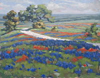
This is a limited palette of primaries, and of coarse it alters all colors mixed from it. Cobalt blue is not a strong, deep blue like Ultramarine Blue, so to strengthen the dark values I also added Gamblin’s Chromatic Black. When I try a new limited palette, I try to paint several paintings from the palette to make sure I have my feet good and wet in the colors. Below are examples of three paintings from this limited palette.
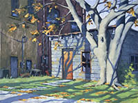
This first work is called “Down Time”, and is a 12 x 24 oil on canvas. The reference photo was one I shot while traveling across the Southeast corner of Colorado. I loved the late evening setting of this forgotten place. It was laying quietly beside a small two lane road, as if it was pondering the many years that had passed since the earth beneath it and it’s individual members had seen the activity of the living.
And let’s face it, there is just something intriguing about old trucks. Maybe this is just a guy thing, I don’t know. But trucks are cool, and old trucks have earned the right to be heard, or seen, whatever the case may be.
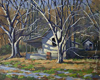
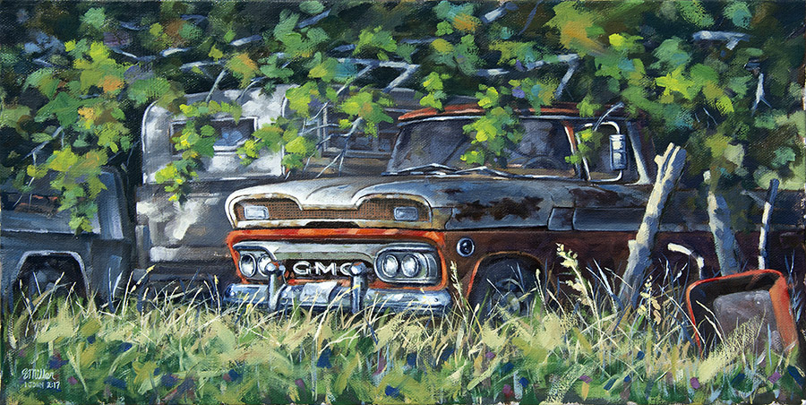
Another truck….
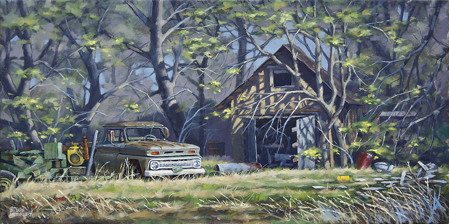
This truck was sitting under the shade trees of a back street of Breckenridge, Texas. I found the subject very interesting and full of mystery. The stories this truck could tell. This work in on canvas as well, using Cobalt Blue, Grumbacher Red and Cadmium Yellow Light.
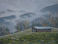
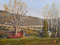
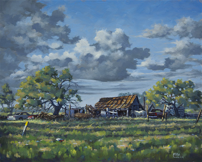
This final example of this particular limited palette also features a truck, as well as a couple old cars and a horse. All resting at the end of a day up in Jack county, Texas.
The LORD’S lovingkindnesses indeed never cease, For His compassions never fail. 23 They are new every morning; Great is Your faithfulness. Lamentations 3:22